
- 39
- 838 138
Your Own KPI
Приєднався 16 лип 2022
Hey, welcome to the channel!
My name is Zsolti and I'm from Hungary but currently living in Berlin, Germany. I'm a Power BI and data tracking enthusiast and I want to share my journey here. I explore and experience with how Power BI works and how to build dashboards productively... while trying to have fun in the process.
If you are about to start your own Power BI journey or you are already in the making, you might find some interesting stuff and inspiration on this channel.
Beautiful Power BI Dashboard Design with Figma | Timelapse
This is a timelapse of building a Power BI report design with the help of Figma. I create the visuals in Power BI then build the UI design in Figma. I hope you enjoy it.
🚀 You want to create reports like this quickly with templates?
yourownkpi.gumroad.com/l/aquasplashtemplate
🍰 You want to get the finsihed dashboard and support the channel?
yourownkpi.gumroad.com/l/dashboardfinishedap
🛠️ You want to build this dashboard yourself?
tutorial is coming..
📸 IG: yourownkpi
🖼️ Dribbble: dribbble.com/YourOwnKPI
👨💼 LinkedIn: linkedin.com/in/zsolt-szabo-bln
⌚ Timestamps
00:00 Visuals in Power BI
01:33 Background in Figma
03:30 Import background in Power BI
04:57 Add buttons and icons
07:58 Finished Dashboard
#yourownkpi #yokpi
Переглядів: 10 974
Відео


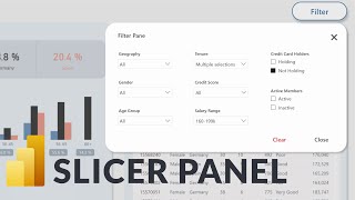
Build a Slicer Panel in Power BI Like a PRO - Part 4
Переглядів 3,3 тис.Місяць тому
This is the fourth part of the slicer panel video series. In the first two videos we built step-by-step a custom filter panel in Power BI and we created a conditional button showing the number of active filters. Additionally in the third video we added a feature to show the selected values. In this video we improve our slicer panel by creating some icons in Figma and importing them in Power BI....

Build a Slicer Panel in Power BI Like a PRO - Part 3
Переглядів 4 тис.Місяць тому
This is the third part of the video Slicer Panel video series. In the first video we built step-by-step a custom filter panel in Power BI and in the escond video we added a filter counter and conditional formatting to the button. Additionally we also created a tooltip to show which slicers are currently filtered. This video is about enhancing the user experience even further and not only show t...

Build a Slicer Panel in Power BI Like a PRO - Part 2
Переглядів 9 тис.2 місяці тому
This is the second part of the slicer panel video series. In the first video we built step-by-step a custom filter panel in Power BI and in this video we create a conditional button showing the number of active filters. It also shows in a tooltip which filters are active. You can check the first part here: ua-cam.com/video/-VXZh-vDmP0/v-deo.html ⬇️ Download Power BI file (Part 2): drive.google....
Build a Slicer Panel in Power BI Like a PRO
Переглядів 53 тис.2 місяці тому
In this video we build step-by-step a custom filter panel in Power BI which we can show and hide upon clicking a button. Besides saving a lot of space, it also enhances the user experience for the dashboard. It is the first part of a 4-video-series on how to build a slicer panel. So stay tuned for the upcoming videos :) ⬇️ Download Power BI file (Part 1): drive.google.com/drive/folders/1jJURnJV...

How to Build Navigation in Complex Power BI Reports
Переглядів 7 тис.4 місяці тому
In this video we go through 4 alternatives to build a navigation in a Power BI report with a lot of pages. What are the advantages and disatvantages of the different alternatives? How to make a complex navigation user friendly? ⬇️ Download Power BI file: drive.google.com/drive/folders/143T7N0wG6FFjZYmW7AxbzNJkSHNieUyr?usp=sharing 📸 IG: yourownkpi 🖼️ Dribbble: dribbble.com/YourOwn...

Power BI Mobile App Design From Scratch (End-to-End Tutorial)
Переглядів 3,8 тис.5 місяців тому
This is a step-by-step Power BI design tutorial to a mobile application using Figma for the design and Power BI for the visualizations. We will create a one page dashboard showing the email volume and its distribution between sent and received emails over time. There is a lot of interactivity on the page with slicers and bookmarks and we also implement some tricks to create a gradient effect in...

How to Make Line Chart Average Range in Power BI
Переглядів 1,7 тис.8 місяців тому
In this video I show how you can make a range for your averages in a line chart. It's not directly available in Power BI but with a little trick you can easily do it. ⬇️ Download Power BI file: drive.google.com/drive/folders/10K7y8auWpSMBOIhk50i5oyAzP2vsABpu?usp=sharing Data Source: www.kaggle.com/datasets/prasertk/historical-daily-oil-and-natural-gas-prices 📸 IG: yourownkpi 🖼️ D...

4 Ways to Show Change Over Time Power BI | Tutorial
Переглядів 4,9 тис.9 місяців тому
Hey, in this video I show step-by-step how to visualize change over time in Power BI. We go through 4 different scenarios where we choose different design and visualizations based on what we want to focus on. ⬇️ Download Power BI file: drive.google.com/drive/folders/1YhMdeTPuM3nlOLFqzVGUQKd6G-TNwBzH?usp=sharing 📸 IG: yourownkpi 🖼️ Dribbble: dribbble.com/YourOwnKPI 👨💼 LinkedIn: l...
4 Ways to Show Change Over Time in Power BI
Переглядів 6 тис.10 місяців тому
In this video we will discover four different ways to show change over time in Power BI. Depending on our goal we can create different visuals and designs to support the quick understanding of what we want to show. 📸IG: yourownkpi 🖼️Dribbble: dribbble.com/YourOwnKPI 👨💼LinkedIn: linkedin.com/in/zsolt-szabo-bln 🎞️Tutorial ua-cam.com/video/g2sfYDPMKy8/v-deo.html Since many of you a...
Stacked Bar Charts: How to Deal with Overcrowding in Power BI? (Solution 2 Tutorial)
Переглядів 2,1 тис.11 місяців тому
In this video I show a way how to transform an overcrowded stacked bar chart into something better. Stacked bar and column charts (vertical bar charts) can be quickly overwhelming because they contain too much information at once. We can take advantage of the interactivity of Power BI and show the informaiton in multiple steps. File Download drive.google.com/drive/folders/1hO5i1BrUsTwExJqdb3rSG...
Stacked Bar Charts: How to Deal with Overcrowding in Power BI? (Solution 1 Tutorial)
Переглядів 2,4 тис.11 місяців тому
In this video I show a way how to transform an overcrowded stacked bar chart into something better. Stacked bar and column charts (vertical bar charts) can be quickly overwhelming because they contain too much information at once. We can take advantage of the interactivity of Power BI and show the informaiton in multiple steps. File Download drive.google.com/drive/folders/1hO5i1BrUsTwExJqdb3rSG...
Stacked Bar Charts in Power BI? This Is How You Do Them
Переглядів 9 тис.Рік тому
In this video I transform a confusing stacked bar chart into something better in Power BI. Stacked bar and column charts (vertical bar charts) can be quickly overwhelming because they contain too much information at once. We can take advantage of the interactivity of Power BI and divide the informaiton into different views. Lean back and enjoy 🎬 📸IG: yourownkpi 🖼️ Dribbble: dribb...
Create an Ultimate Power BI Button Set in Figma | Tutorial Step-by-Step
Переглядів 4,4 тис.Рік тому
With this video you can create your own button set which you can reuse for your different Power BI dashboards and reports. Figma makes it easy to create scalable elements with styles and components, which you can then simply import into your Power BI projects. *FILE DOWNLOAD LINK* drive.google.com/drive/folders/198kglX3Q6R6cFioh2Eo3YANwqQRJ8UL7?usp=sharing Instagram: yourownkpi #...
Power BI Design Tutorial with Figma | AI Inspired Dashboards
Переглядів 53 тис.Рік тому
In this video I do a Power BI report design makeover with the help of Figma. The sales report has 3 dashboards and I create the design based on AI generated pictures from Midjourney. 📁Download Link📁 drive.google.com/drive/folders/1-_SyPODmVENnj2wTg3tzowqvKIwToZnt?usp=sharing 📸 IG: yourownkpi 🖼️ Dribbble: dribbble.com/YourOwnKPI Since many of you asked how I learn Power BI, here a...
Insane Power BI Dashboard Design with Figma | Timelapse
Переглядів 435 тис.Рік тому
Insane Power BI Dashboard Design with Figma | Timelapse
Get Your Line Charts Under Control 2 | Design Makeover Power BI
Переглядів 3,7 тис.Рік тому
Get Your Line Charts Under Control 2 | Design Makeover Power BI
Get Your Line Charts Under Control 1 | Design Makeover Power BI
Переглядів 4,2 тис.Рік тому
Get Your Line Charts Under Control 1 | Design Makeover Power BI
Stunning Email Report Design with Power BI & Figma | Tutorial
Переглядів 19 тис.Рік тому
Stunning Email Report Design with Power BI & Figma | Tutorial
Bring Power BI to life with Figma | Timelapse email report
Переглядів 12 тис.Рік тому
Bring Power BI to life with Figma | Timelapse email report
Can I build a Power BI dashboard with AI from scratch?
Переглядів 17 тис.Рік тому
Can I build a Power BI dashboard with AI from scratch?
My favourite keyboard shortcuts - Power BI productivity
Переглядів 1,4 тис.Рік тому
My favourite keyboard shortcuts - Power BI productivity
How good do you need to be to get a Power BI job | Self-assessment & my experiences
Переглядів 1 тис.Рік тому
How good do you need to be to get a Power BI job | Self-assessment & my experiences
Power BI Design Tutorial with Figma | Beginner's Guide
Переглядів 39 тис.Рік тому
Power BI Design Tutorial with Figma | Beginner's Guide
Power BI bar chart gets a gradient touch with Figma
Переглядів 13 тис.Рік тому
Power BI bar chart gets a gradient touch with Figma
Power BI Context Transition - The Good, the Bad and the Ugly
Переглядів 1,4 тис.Рік тому
Power BI Context Transition - The Good, the Bad and the Ugly
Power BI timelapse | Dashboard building using Figma
Переглядів 86 тис.Рік тому
Power BI timelapse | Dashboard building using Figma
How iteration works in Power BI - X functions behind the scene
Переглядів 1,5 тис.Рік тому
How iteration works in Power BI - X functions behind the scene
How to make a free work email for Power BI
Переглядів 3,6 тис.Рік тому
How to make a free work email for Power BI
How to connect Google Sheets to Power BI
Переглядів 14 тис.Рік тому
How to connect Google Sheets to Power BI
I really like this channel
this helped my dashboard look so neat and tidy, thank you very much!
Hi I have doubts about the slicer is this possible to when we select any category in the slicer then the slicer pop up does not disappear automatically when we have to click any other place then the slicer pop up disappear. Any solution i want when we click on the category in slicer then the slicer pop up automatically disappears.
Great :) congratulations!!
Can I import google sheets in power BI online version?
Hi, this is very insightful, thanks a lot. Quick question, do I have to repeat the whole filter creation process on every page/tab I have? I tried copying and pasting but it takes me back to page 1 and filters only the data on that page. How can I solve this issue?
Youre welcome :) Yes you have to set up the bookmarks on each page individually
Just came across this channel, amazing and will be watching many more videos
Awesome, thank you!
Fantastic !!
hi. recent subscriber here. Question, at 8:07, how did you pick up and copy the blue color? I checked the Power BI documentation, and I can't seem to find the keyboard shortcut for that. TIA!
Welcome to the channel 🤗 I just had it somewhere saved and copied it with Ctrl+C Ctrl+V haha
@@yourownkpi Ha ha! I thought you were using a color picker since I could not find the keyboard shortcut. Nevertheless, still an amazing tutorial, learned. a lot. Thanks!
CTRL + D, powerful!
💪💪
Great work on this! Applied this logic to one of my key dashboards. Bravo!
thanks amd Im glad it helped :)
Thank you brother, its really a very knowledgable session, hats off!!
Great work. You really do your best with the dashboard UX. I wanted to ask did you use a custom visualization for the table? I tried my best with the tables in PowerBI but the still look rigid as heck. Do you have any tricks up your sleeve?
Thanks :) No it's the native table and I used a shape for the header background. You can check out how it's been built in the download file
Awesome tips, thanks again for sharing with the community !
Youre welcome :)
I'm looking for a freelance Power BI designer for a finance project. Reply if interested.
I am looking to do freelance projects have also made power bi dashboards in the past still practicing to keep up with the trend.
hey, you can reach out to me on linkedin and we can look into it. www.linkedin.com/in/zsolt-szabo-bln/
Azure active directory is no longer exist. Change with Azure Entra ID, but cannot click
you are a reference in power bi desgin for me, from spain increible.
thank you thats great 😊
Nice work Sir!
Thanks :)
Good job! Very clear, professional, and on point!
Love this Minimalist design . Saw some dashboards which looks like straight out of Alien star ship panel.
.b.i.n.a. .s.a.r.a.n.a. .i.n.f.o.r.m.a.t.i.k.a.
:D
Nice. Very very nice.
🙃it's amazing thanks
Art!
Neat
I wonder what the performance of the report would be with a database of over 2 million rows and the amount of distinct visuals that are in. Most likely, the refresh time would be between 5 and 10 seconds by the look of it. Otherwise, it's a very nice design.
there aren't that many visuals on the page 🤔
@yourownkpi I counted about 14 different visuals, 2 slicers, plus the text boxes and buttons. If I am mistaken, I do apologise.
mmmh yes, this looks aesthetically pleasing :)
thanks :)
amazing beautiful
This is amazing! I just started a BI Analyst role and your videos have been incredibly helpful!
Fantastic :)
That's amazing. You make it look easy.
haha thanks :D
really nice! beautiful
Glad you like it!
Another top-notch job! What I liked most is that it used the color palette that I use in my projects. In my new Human Resources project I will use this gradient and share it on Linkedin
Awesome :) Blue and green can work quite well together
🔥🔥🔥🔥🔥🔥🔥
This is art!
thanks very much appreciated :)
The definition of modern art has been successfully updated.
thanks :D
JUST Ultimate 👌👌
Hi, Where can I find maps like the one you are using in the video?
this is a native visual in Power BI. You have to enable Shape Map i the Options/Preview Settings
great video!
Amazing Technique. Can you also give us tutorial on how to copy and paste this bookmark ( slicer panel) in another sheet? or how we save this slicer panel as template then we can use in other reports too.
Im glad you liked it :) As far as I know it's not possible to copy bookmarks in Power BI. You have to create them manually on each page.
Very nice I will implement it in my current project
Great 👍
Hello, I like this video alot , but I have one question if I make a filter pane and filter the options and if i Have a power APP tool so will the filters remain unchanged ?
Hey thanks :) I can't really tell you, I'm not familair with the Power Apps
Nice work. I’ve got a question on the Nav Special Country. Since it mimics dropdown menu, what happens to the dropdown menu when the menu item is clicked? For me, it navigated to related page.but the menu stayed there. When I navigated back to the previous page, my dropdown menu just hung around. Is there any way to collapse the menu once the menu item has been clicked? Thank you.
Yes thats an issue unfortunately. The only thing I can think of is to create bookmarks instead of using page navigatiors. But then it's too much effort to do this feature.
Beautiful city in your wallpaper computer and screens. Rsrsrs. City where I live, near sugarloaf. Oh, I subscribed in our channel yesterday. Its been very useful for me. Thanks.
Im glad that the channel is useful for you and you live in one of the most beautiful cities! Good for you haha
I like your videos and how you implement UX while building dashboards👍🏻, I wish you could make a video for interactive dashboard showing the details of my data in same page, such as overview page with ability to show details table in same page in more user friendly experience
Always inspired by your work Zsolt, thank you so much for sharing.
Thats great to hear and youre welcome :)
Great tutorial. Thank you for sharing
Thanks for watching!
thank you!
Awesome filter man!! I noticed when I select a single column value in a table visual the counter is activated and it shows a count of 3, and in some other visual like pie chart, it would show count of 2. Any solution to this?
Thanks! Thats a good point. What I can think of is to disable the interaction between the visuals in which slicer data is used. In the example it would be necessary to disable the interaction from the two column charts in the direction of both the filter counter and the button itself
Great walkthrough! thank you!
You're welcome!
Your creativity is amazing,thanks for sharing the pbi file
just one question . why??????????????????